Salomon
Construction Ltd

Kamil K –Salomon Construction Ltd

Salomon Construction Ltd approached us seeking a comprehensive rebranding, including a new landing page and both print and digital assets. Initially, the client envisioned a brochure that showcased various aspects of construction. However, we guided him to concentrate on his unique selling proposition (USP) that was already performing well: kitchens and bathrooms. This strategic focus allowed us to create a cohesive and impactful brand identity that effectively highlights the company’s strengths.

Project Goals

What were the objectives?

The primary objective was to develop a brand that embodies luxury and resonates with a wealthy target audience. By crafting an upscale identity, we aimed to attract high-income clients who appreciate and seek premium quality in products and services.
Timeline: Duration of the project–1 month

Challenge

The client faced challenges in attracting the desired clientele due to an unappealing brand image and perception that failed to resonate with consumers. Unsure of how to address this issue, we initiated the process by creating a mood board and gathering data from successful brands. This approach helped us identify effective design elements and strategies that could be leveraged to enhance the client’s brand appeal and attract the right audience.

Research

To develop a brand capable of competing with other high-end kitchen and bathroom companies, we began by thoroughly evaluating existing brands in the market. This involved analyzing their strategies, aesthetics, and core values. Notable examples included Eadonstone, Sheewater Home, and Ocean Kitchens and Bathrooms. Based on our findings, we shifted our focus to defining the client’s core values, selecting appropriate color schemes and their meanings, choosing typography, and determining the desired brand perception. This comprehensive approach ensured that the new brand would effectively stand out in the competitive landscape.

Design Process

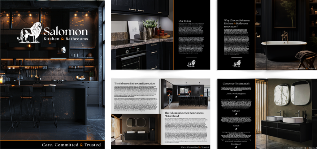
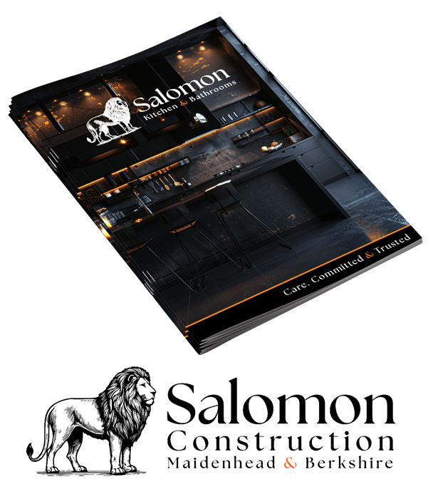
Once we gathered sufficient information, our design team began developing concepts that reflected our insights and findings. The resulting designs, showcased in the images below, embody the strategic direction we established for the brand.
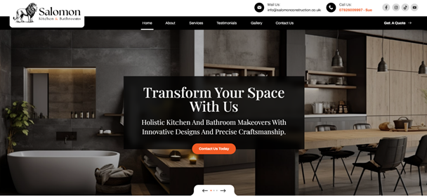
Simultaneously, we utilized this information to develop a purpose-driven website designed to attract and engage the ideal customers. The site features intuitive navigation and appealing design elements that effectively highlight the brand’s offerings, ensuring it resonates with the target audience.

Final Solution

Here is the final result. After incorporating a few adjustments, the client was delighted with the outcome, which transformed the representation of his business from what it had been initially. The new design effectively conveys a fresh and compelling image that aligns with his vision and objectives.

Reflection

This project presented an excellent opportunity for us to showcase our best work and demonstrate to other construction businesses the potential of partnering with a design agency like ours. We aimed to create a standout brand identity that reflects quality and professionalism. Following the successful completion of this project, we are now engaged in discussions to collaborate on additional initiatives, including workwear design, merchandising, and van livery. These efforts will further enhance the client’s brand visibility and cohesion across various platforms, reinforcing their position in the market.
Let's create together